A Simple Guide For Adding Dark Theme To GatsbyJS

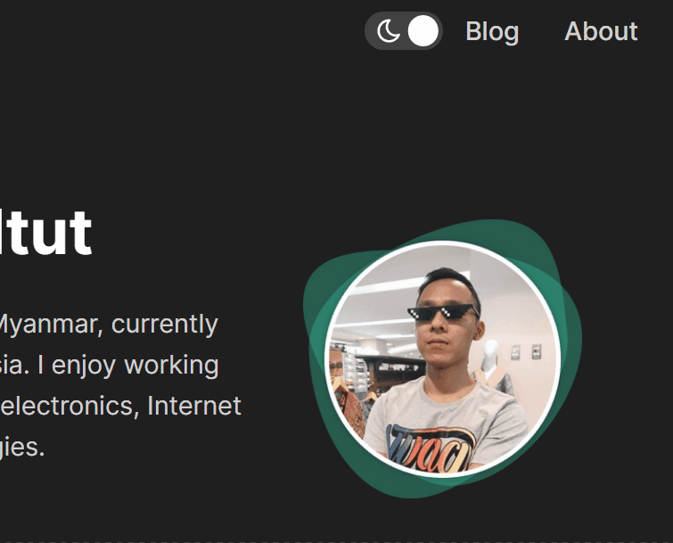
Recently, I have implemented dark mode theme to my GatsbyJS blog website. You can try the dark mode toggle in the header navigation bar. In this post, I will share a simple guide on how to add dark mode theme to my website. I am using GatsbyJS as an example in this post. Of course. If you are also using others like Next.JS, it is also fine to follow along and understand the ideas and concepts.
TLDR. For toggle component, use react-toggle or react-dragswitch and gatsby-plugin-theme-switcher plug-in.
1. Building toggle switch component
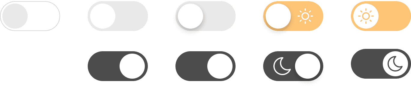
First, let's build a simple toggle which can switch between light and dark theme. Toggle switch component will be suitable since we are adding only two theme(light and dark) at the moment. If you decided to use out-of-the-box toggle components libraries, you can skip this section and move on to next. The following are the examples of toggle switch components libraries:
The reason why I want to build my own toggle component is to avoid unnecessary increase in bundle size. The cost is that I have to spend some time building from the scratch. There is no right or wrong. It all depends on what price you are willing pay for.
Before I start writing in React component, I always use Figma to sketch my draft components. Figma let me experiment on the prototype component's designs and colors. You can also use other design tools like Sketch and Adobe's products. Here are some of the components that I designed in Figma:
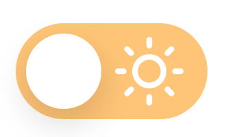
Once I decided to pick one of the design, I started translating design into codes. I use pure CSS but if you prefer to use like Tailwind, you get the idea. Here is the translated codes from Figma design.
Here is the code for DarkModeToggle.tsx
import React from "react"

import "../styles/DarkModeToggle.css"

const DarkModeToggle = () => {
  return (
    <div className="DarkModeToggle">
      <label htmlFor="dark-mode-toggle">
        <input
          className="DarkModeToggle__input"
          type="checkbox"
          name="dark-toggle"
          id="dark-mode-toggle"
        />
        <div className="DarkModeToggle__knob" />
        <div className="DarkModeToggle__bg" />
      </label>
    </div>
  )
}

export default DarkModeToggle
And for DarkModeToggle.css
.DarkModeToggle {
  --dark-toggle-width: 56px;
  --dark-toggle-height: calc(var(--dark-toggle-width) / 2);
  --dark-toggle-radius: calc(var(--dark-toggle-height) / 2);
  --dark-toggle-knob-width: calc(var(--dark-toggle-height) - 6px);

  cursor: pointer;
  display: flex;
  position: relative;
}

.DarkModeToggle__input {
  display: none;
}

.DarkModeToggle__input:checked ~ .DarkModeToggle__bg {
  background-color: var(--grey-20);
}

.DarkModeToggle__input:checked ~ .DarkModeToggle__knob {
  box-shadow: none;
  transform: translateX(var(--dark-toggle-height));
}

.DarkModeToggle__input:checked ~ .DarkModeToggle__knob::before {
  opacity: 1;
  visibility: visible;
}

.DarkModeToggle__input:checked ~ .DarkModeToggle__knob::after {
  opacity: 0;
  visibility: hidden;
}

.DarkModeToggle__bg {
  background-color: #ffc577;
  border-radius: var(--dark-toggle-radius);
  height: var(--dark-toggle-height);
  position: relative;
  transition: background 0.3s ease;
  width: var(--dark-toggle-width);
}

.DarkModeToggle__knob {
  --offset-diff: calc(
    var(--dark-toggle-height) - var(--dark-toggle-knob-width)
  );
  --offset-padding: calc(var(--offset-diff) / 2);

  background-color: var(--color-white);
  border-radius: var(--dark-toggle-radius);
  box-shadow: 0px 4px 10px rgba(0, 0, 0, 0.15);
  content: "";
  height: var(--dark-toggle-knob-width);
  left: var(--offset-padding);
  position: absolute;
  top: var(--offset-padding);
  transition: transform 0.3s ease;
  width: var(--dark-toggle-knob-width);
  z-index: 1;
}

.DarkModeToggle__knob::before,
.DarkModeToggle__knob::after {
  --offset-sun: calc(var(--dark-toggle-knob-width) + 2px);

  background-attachment: initial;
  background-position: center;
  background-repeat: no-repeat;
  border-radius: var(--dark-toggle-radius);
  content: "";
  height: 20px;
  position: absolute;
  top: 1px;
  transition: all 0.1s ease;
  width: 20px;
  z-index: 1;
}

.DarkModeToggle__knob::before {
  background-image: url("../images/svg/icn-moon-white.svg");
  left: calc(var(--offset-sun) * -1);
  opacity: 0;
  visibility: hidden;
}

.DarkModeToggle__knob::after {
  background-image: url("../images/svg/icn-sun-white.svg");
  right: calc(var(--offset-sun) * -1);
}
And the finally result will be:
2. Adding functionalities to toggle component
The goal is simple. Change the dark theme globally whenever user toggles the switch. We can take advantage of React Context in this case. In simple words, we are going to store our theme key and value in global and consume it from any of the component.
Install Gatsby plug-in
I use gatsby-plugin-theme-switcher. Not only dark theme, it also allows us to switch between many themes. It uses global CSS variables and changes the colors respective to the selected theme.
npm -i gatsby-plugin-theme-switcher@latestI importeduseState to control the various states of the toggle component. I useduseContext to consume the theme state which is store in global.useEffect for to call functions after the render. But there is one minor issue every time I refresh the page. <DarkModeToggle /> component will render the light state at first by default. Then, it will have a sudden switch to dark state if user selected for dark theme. To avoid this, I added isLoading to track whether the component has been loaded or not.
So here is the code snippet after combining together.
import React, { useEffect, useState, useContext } from "react"
import { ThemeContext } from "gatsby-plugin-theme-switcher"

import "../styles/DarkModeToggle.css"

const DarkModeToggle = () => {
  const { theme, switchTheme } = useContext(ThemeContext)
  const [isLoading, setIsLoading] = useState(true)
  const [isDarkMode, setDarkMode] = useState(theme === "theme-dark")
  const themeSelected = isDarkMode ? "theme-dark" : "theme-light"

  useEffect(() => {
    setIsLoading(false)
  })(() => {
    switchTheme(themeSelected)
  }, [isDarkMode])

  const toggleDarkMode = () => {
    setDarkMode(!isDarkMode)
  }

  if (isLoading) {
    return null
  }
  return (
    <div className="DarkModeToggle">

      <label htmlFor="dark-mode-toggle">

        <input
          checked={isDarkMode}
          className="DarkModeToggle__input"
          type="checkbox"
          name="dark-toggle"
          onChange={toggleDarkMode}
          id="dark-mode-toggle"
        />

        <div className="DarkModeToggle__knob" />

        <div className="DarkModeToggle__bg" />

      </label>

    </div>
  )
}

export default DarkModeToggle
Add CSS variables for dark theme
Let's create new theme.css with all the CSS variables. According to the documentation, we can add many themes as we like by using .theme-* as below:
.theme-dark {
  --color-primary: #36bc99;
  --color-primary-light-20: #5ec9ad;
  --color-primary-light-40: #86d7c2;
  --color-primary-light-60: #afe4d6;
  --color-text: var(--text-white);
  /* -snip- */
}

.theme-light {
  --color-primary: #226ce0;
  --color-primary-light-20: #226ce0;
  --color-primary-light-40: #226ce0;
  --color-primary-light-60: #226ce0;
  --color-text: var(--text-white);
  /* -snip- */
}

.theme-neo {
  /* -snip- */
}
Then, import theme.css file in gatsby-browser.js
import "./src/styles/global.css"
import "./src/styles/themes.css"
Conclusions
Finally, we now have added a simple dark theme to our GatsbyJS site. There are different methods to achieve the same goal. You can go down to nitty-gritty details in both technical and design aspects. But this is a simple guide to help you get started and implement to your own requirements on top of this. If you have added your own dark theme with different approaches, feel free to share with me via email. I am excited to hear from you.

